It’s fascinating to think about the visual language of a place, what goes into the design of an icon. I love paying attention to Olympic sports pictograms, or how bathroom signs indicate genders—how do we depict and differentiate people through simple shapes?
Traffic lights and road crossing signs in particular have caught my eye. How do they represent their population? Furthermore, how can they improve quality of life, especially for the handicapped and elderly? Here are some examples of traffic lights and street crossings that have broken convention and stood out to us.
Representing Women in Valencia, Spain
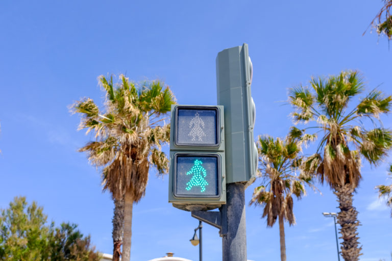
On International Women’s Day in 2016, the city of Valencia introduced female figures on traffic lights. Though there was some controversy—such as the fact that women were represented with dresses—the change was, for the most part, supported. According to Equal Rights Commissioner Isabel Lozano, “We want to make women visible as we build the city.” Bonus points for the fact that the updated traffic lights didn’t create any additional cost for the city. They had already allocated money to upgrade old traffic signs with LED ones, so all they had to do was change the symbols. As the older traffic lights wear out, the city will continue to replace them with a female presence.
Celebrating indigenous culture in Wellington, New Zealand
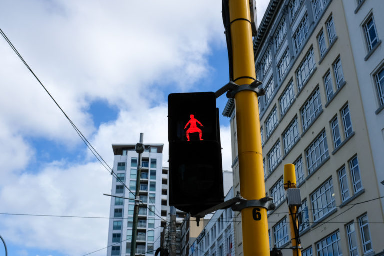
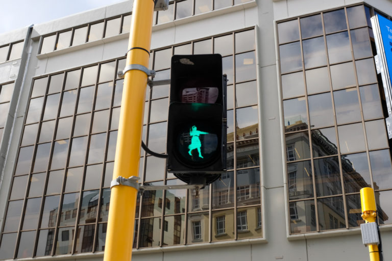

Māori are the indigenous people of New Zealand, currently making up 14% of the country’s population. They have a ceremonial dance, haka, which is full of energy and tension and often featured in celebrations like weddings and birthdays. In honor of a haka festival that took place in Wellington, the capital of New Zealand decided to install pedestrian crossing lights representing haka poses. Through these signals, the city gave a more nuanced reflection of local culture.
Creating a cult icon in Berlin, Germany
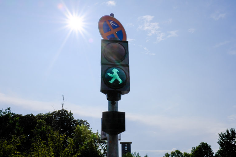
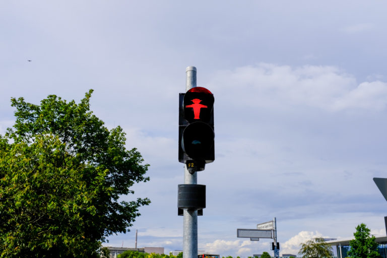
There’s a ubiquitous figure on the streets of Germany: Ampelmann. He’s not only on all the traffic lights of the city—he’s also become a brand, with his own stores and cafes. Why is he so popular? Perhaps it’s because he’s cute and looks friendly with his hat and plump figure. People are drawn to his childlike shape, big head and short legs, and wide open stance. Also, since he’s larger than other traffic light figures, he brings more visibility and light to the streets.
Embracing Japanese culture in São Paulo, Brazil
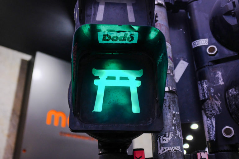
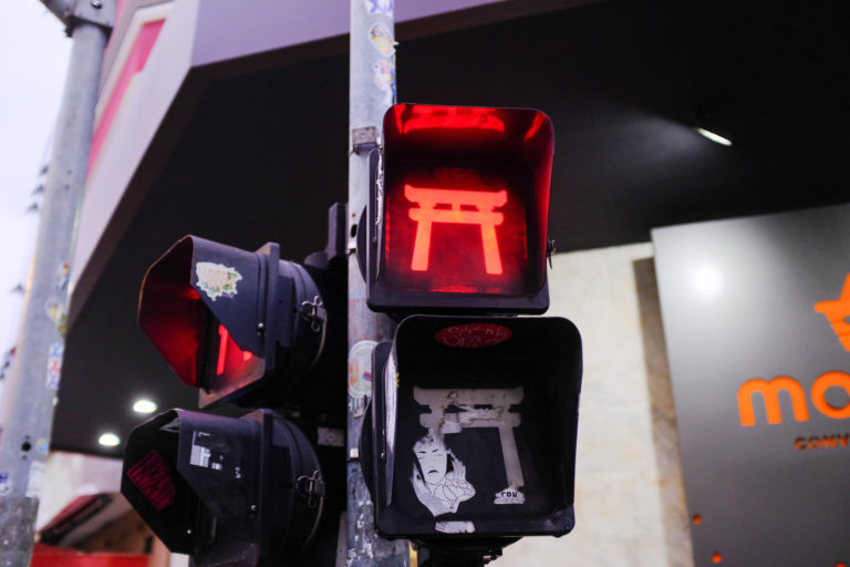
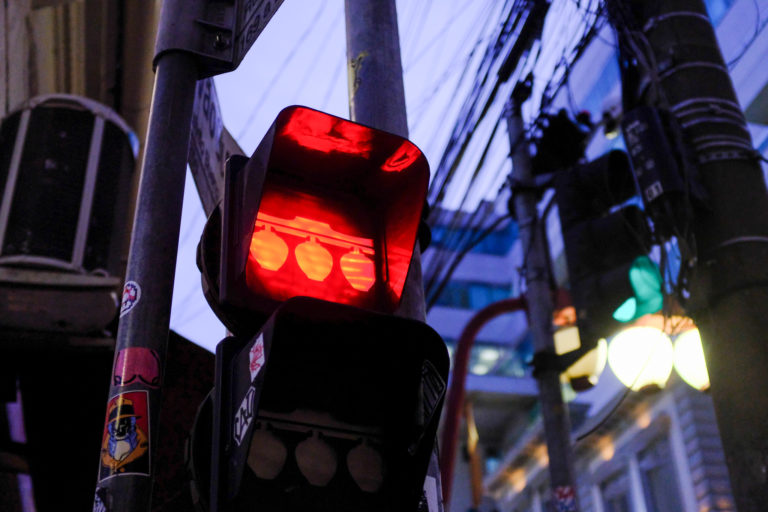
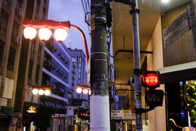
São Paulo is home to the largest population of Japanese immigrants. The liberdade neighborhood is home to most of them. I was delighted to find that the traffic lights reflected aspects of culture, from the lanterns on the street to the neighborhood gate.
Bringing some fun in Buenos Aires, Argentina
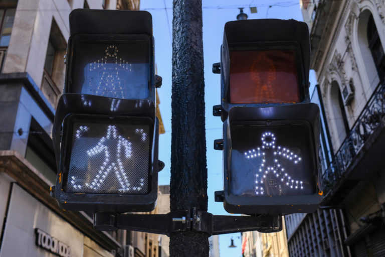
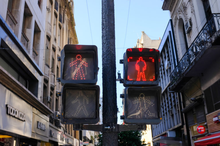
There seem to be two types of traffic lights in Buenos Aires: a set of stern, angular figures and rounded, fun ones that look like they’re ready to have a good time. I’m assuming the rounded ones are newer, since they look like LED lights, so perhaps the city is going through an upgrade. We have no idea why they’re sometimes depicted side by side, but we’ll continue asking around.
Taking it slow in Santiago, Chile
In downtown Santiago, you can find this chill guy strutting along, letting you know it’s time to cross the street.
Lighting up streets in Lisbon, Portugal and Melbourne, Australia
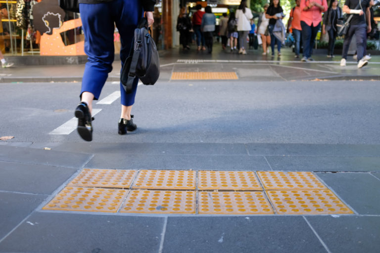
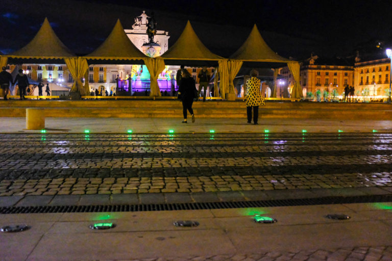
Many of us are glued to our phones, even when we’re crossing the street! People in Portugal and Australia noticed this unfortunate habit, so they decided to create phone-friendly crossways. By lighting up the streets below our feet, pedestrians can see when it’s time to cross safely even when they’re looking down. It’s a solution that alleviates symptoms, not the root problem, but it’s nice to experience this type of consideration.
Guiding the blind in Tokyo, Japan
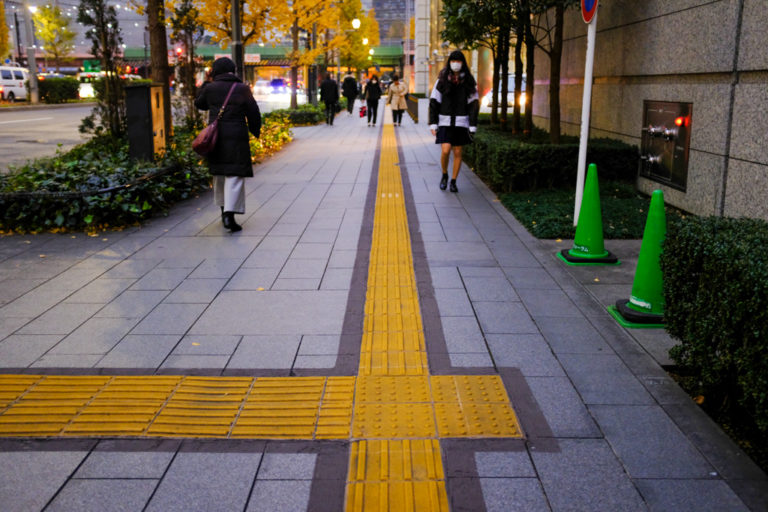
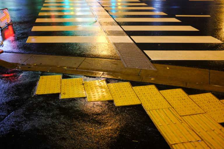
In Japan, there’s a concept called omotenashi: anticipating other peoples’ needs and wholeheartedly looking after guests. Mostly, it applies to the service and hospitality industry. If you take off your shoes at a restaurant, they will be placed facing the door so it’s easier for you to slip into them when you walk out. If you get into a taxi, the driver will open the door for you. But we’ve also experienced this level of consideration applied to the streets.
Along major roads and sidewalks, in subway stations and bus terminals, there are bright yellow rubber surfaces covered in bumps and ridges. Known as Tactile Ground Surface Indicators or tenji blocks, they’re a form of braille to help the blind navigate the streets. Blind pedestrians know where to stop when crossing the streets, when to turn the corner along a sidewalk, or where to board a train. It’s a great example of accessible city design, and shows just how much consideration and helpfulness is embedded in Japanese culture.
For more inspiration on traffic lights and crossways:
- Design firm Daily Tous Les Jours did a project on alternative traffic lights, inviting pedestrians to take over the streets of San Francisco with music
- Wired published an article on The Hidden Genius and Influence of the Traffic Light
- Interesting Engineering collected examples of futuristic traffic lights


